
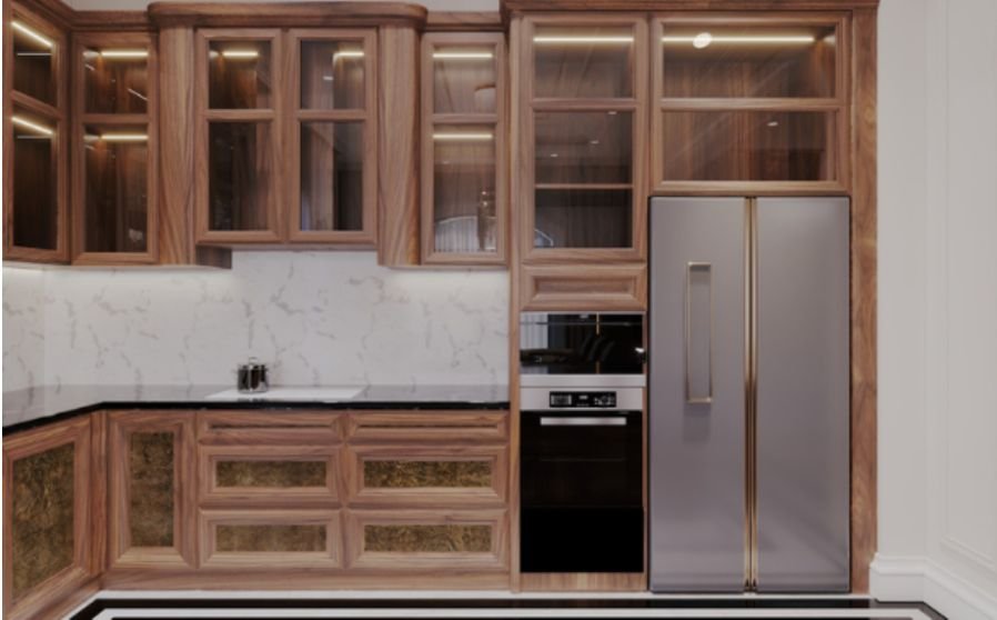
I find that a beautiful tile can look completely different beside a wooden cabinet. A white sample might suddenly appear blue, while beige can bring out unexpected pink tones. That makes choosing by a showroom display or online photograph surprisingly unreliable.
My approach to how to choose tiles that complement wood cabinets starts with the finishes already in the room. Cabinet undertones, countertops, lighting, and grout all influence the result. Once those relationships make sense, narrowing the options becomes easier—and expensive mistakes become easier to avoid.
Identify the Wood’s Undertone First
Cabinet color involves more than light or dark brown. Look closely for underlying yellow, orange, red, gray, or neutral beige tones. The stain and finish matter as much as the wood species.
Hold plain white paper beside a cabinet door to make its color cast easier to recognize. Compare several sections because natural grain introduces variation.
Warm wood often works comfortably with creamy whites, earthy taupes, and muted greens. Cooler finishes can suit cleaner whites, balanced greige, and charcoal accents. These are starting points rather than fixed rules; deliberate contrast can also look beautiful.
Choose Between Blending and Contrast

Decide whether you want the tiles to create a quiet background or become a focal point.
For a blended scheme, select related undertones and gentle differences in brightness. Pale wood with soft limestone-look tile can feel cohesive without matching exactly.
For contrast, vary lightness, color, or texture. Dark walnut beside ivory ceramic creates separation, while smooth cabinetry beside subtly textured tile adds depth.
If you want to introduce visual interest without overwhelming the natural grain of your cabinets, combine tile shapes and patterns thoughtfully. These tips on how to mix tile shapes without making a room look busy can help you balance contrasting textures and create a cohesive design.
Consider the wood grain too. Strong cathedral patterns already create movement, so surrounding surfaces usually benefit from restraint.
Coordinate With Countertops and Adjacent Finishes
For backsplash decisions, compare tile directly with the countertop because these surfaces meet. A white tile that suits the cabinets may clash with a cream counter.
Busy granite or dramatic veining often benefits from quieter tile. With a plain countertop, there is more room for interesting shapes, glaze variation, or restrained pattern.
Include appliances, hardware, wall paint, and neighboring floors in your assessment. Brass can reinforce warmer notes, while stainless steel introduces a cooler element. You do not need every finish to match, but repeated colors help the room feel connected.
Explore Pairings for Different Wood Finishes
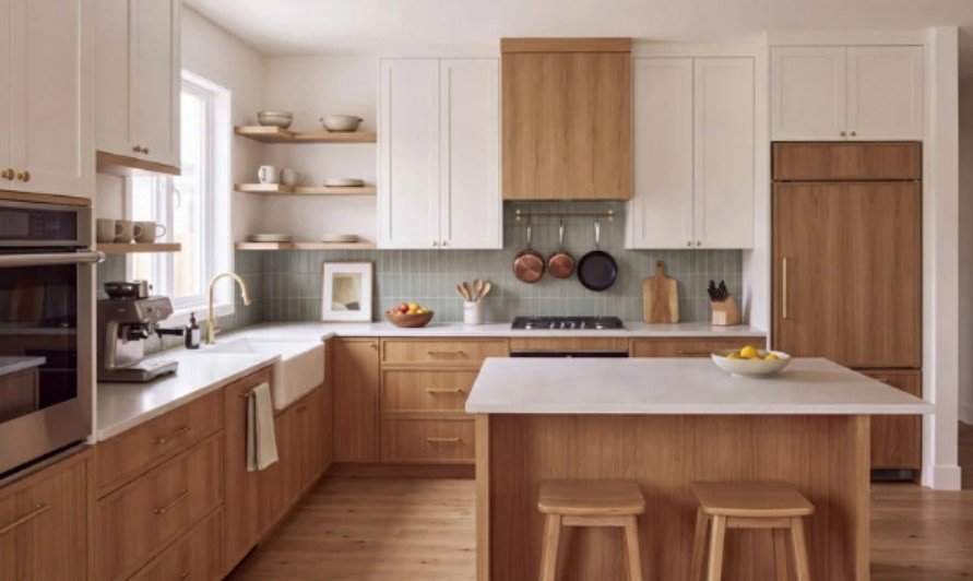
Light Oak and Maple
Warm white, pale greige, and subtle stone-look tiles can preserve an airy appearance. If the cabinetry looks washed out beside a pale tile, introduce slightly deeper grout or gentle surface texture.
Check the actual finish rather than assuming all light woods share an undertone.
Honey Oak and Golden Wood
Soft ivory, earthy taupe, and muted sage are useful options to sample. A strongly cool gray may make golden cabinetry appear more orange through contrast.
Blue can still work when that contrast is intentional and supported by the countertop and surrounding palette.
Cherry and Red-Toned Cabinets
Try soft ivory, balanced taupe, or subdued green. Watch pink-beige samples carefully because they may emphasize the cabinet’s reddish cast.
Keep heavily patterned tile away from pronounced grain unless the remaining finishes are especially simple.
Walnut and Espresso Cabinets
Lighter tile can create breathing room around dark cabinetry. Consider warm white, pale stone effects, or softly veined porcelain.
Dark tile can also create an inviting atmosphere when daylight, task lighting, and lighter countertops provide enough visual separation.
Treat Backsplash and Floor Tiles Differently
Understanding how to choose tiles that complement wood cabinets means considering where each tile will go.
Backsplashes sit near eye level, so grout lines, texture, and reflective finishes become prominent. Behind cooking areas, consider how easily grease wipes from textured surfaces.
Floors cover a larger area and need products approved for floor use. Check the manufacturer’s suitability information for the intended conditions rather than assuming a matte finish guarantees traction.
Where tile meets existing hardwood, compare samples together. A stone-look floor often offers clearer separation than a wood-look tile that almost matches the neighboring boards.
Balance Material, Size, Pattern, and Grout
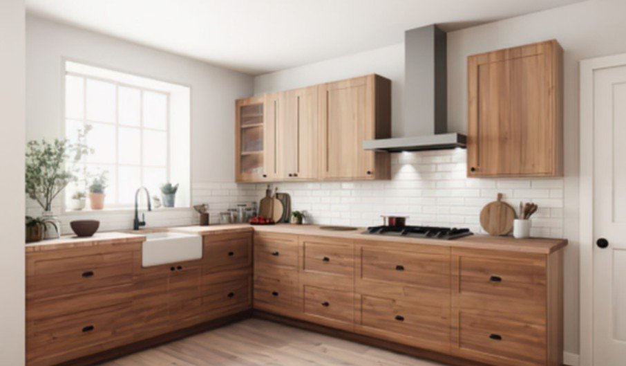
Ceramic offers extensive color choices for walls. Porcelain provides many floor-rated options and convincing stone effects. Glass introduces reflectivity, while natural stone brings variation with care requirements that depend on the specific material.
Choose scale in relation to the whole room. Larger tiles reduce the number of joints, but cuts around outlets, corners, and cabinets still affect the finished appearance. Small mosaics add detail and may compete with active wood grain.
Matching grout produces a quieter surface. Contrasting grout emphasizes the layout. Compare grout samples alongside the tile before ordering, and include edge trim and exposed tile ends in the plan.
As you finalize the tile layout, consider how exposed edges and transitions will look alongside your chosen cabinet and grout colors. These tile edging options for a clean and finished look can help you select a suitable border for backsplashes, corners, and other visible tile edges.
Test Samples Before You Commit
Bring home several full tiles or a complete mosaic sheet. Tiny chips cannot reveal repeating patterns or the range of shade variation.
When planning a tiled backsplash, remember to account for electrical outlets before finalizing the layout. This guide on how to install mosaic tile sheets around electrical outlets explains how to approach mosaic placement around these openings for a neater finish.
Stand backsplash samples vertically against the wall. Place floor samples flat near the cabinet base. Check both in morning daylight, afternoon light, and under evening fixtures.
Under-cabinet lighting can exaggerate uneven surfaces and shadows. View the arrangement from across the room as well as close up.
Before buying, compare installed quotes that include preparation, cuts, trim, and layout complexity. Confirm the proposed layout and retain spare tiles for future repairs.
Frequently Asked Questions
1. What is the easiest way to learn how to choose tiles that complement wood cabinets?
Start with the cabinet undertone, compare tile against the countertop, and test full samples under actual room lighting. Choose grout at the same time.
2. Should tiles be lighter than wood cabinets?
Lighter tiles can brighten dark cabinetry, but they are not mandatory. Similar-value or darker tiles can work when texture, lighting, and other finishes provide separation.
3. Can patterned tiles work with wooden cabinets?
Yes. Keep the countertop simple and choose a pattern whose colors relate to the wood. Strong grain usually pairs more comfortably with restrained tile patterns.
Final Thoughts
I would choose tile by comparing complete combinations rather than falling for one sample. The strongest pairing respects the cabinet finish, connects with the countertop, and feels right throughout the day.
Taking time to test tile, grout, and lighting together gives me more confidence than following a trend. A coordinated, practical combination can refresh wood cabinetry while preserving the character that makes it appealing.