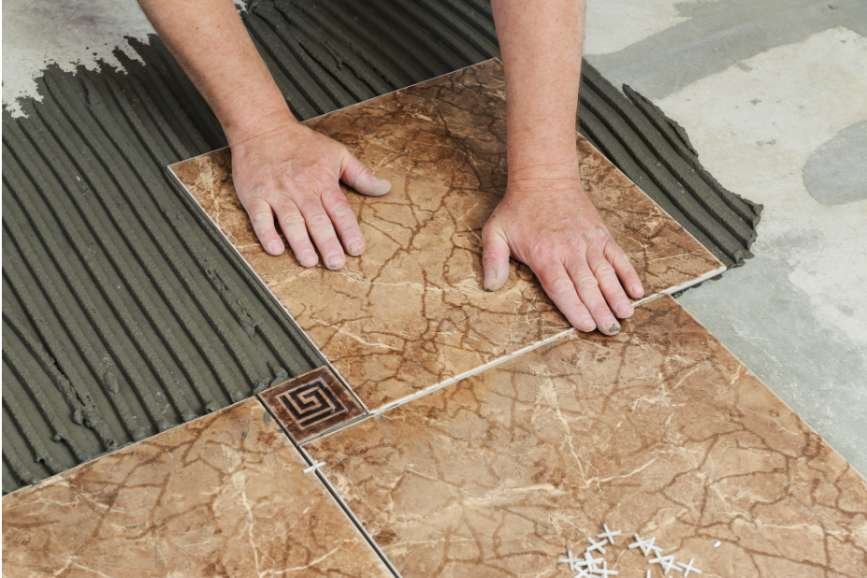

I find it easier to appreciate a mosaic’s colors before grout enters the picture. Once the joints are filled, the same tiles can look softer, busier, brighter, or more defined. That small finishing detail deserves attention before installation begins.
If you’re wondering how to choose grout colors for mosaic tiles, start with the effect you want, then compare compatible products beside your actual tile. Whether you’re updating a kitchen backsplash or bathroom floor, a physical sample helps you make a more confident decision.
Decide What You Want the Grout to Highlight
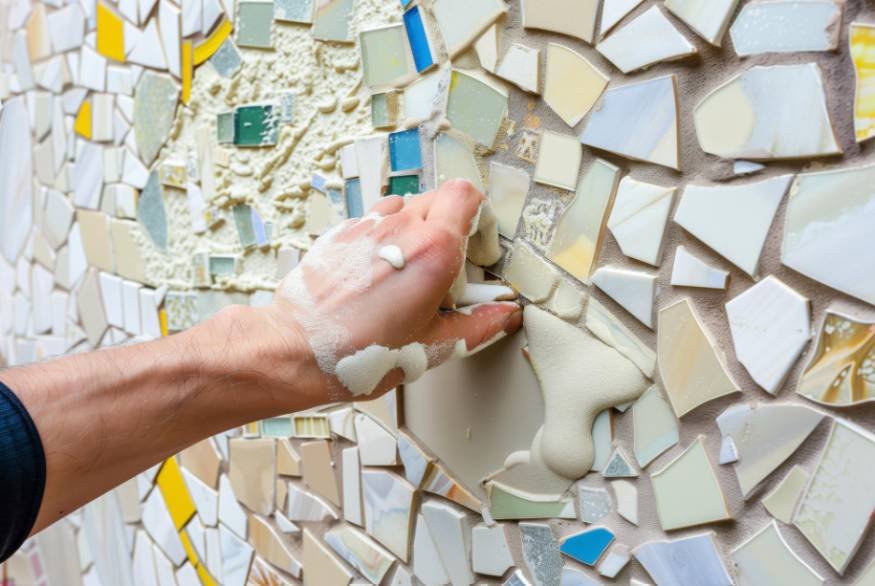
Mosaic sheets contain numerous small tiles, so their joints become an important part of the finished design. Choose whether you want those joints to blend into the background or outline individual pieces.
Matching Grout Creates a Quieter Surface
Grout close to the tile’s dominant color reduces visible separation. This approach suits busy patterns, delicate marble veining, and spaces where countertops or cabinetry already attract attention.
Matching does not require an identical shade. Compare nearby options and choose one that feels intentional. A subtle difference can preserve the mosaic’s texture while keeping the overall surface calm.
Contrasting Grout Defines Tile Shapes
Contrast emphasizes penny rounds, hexagons, and other geometric mosaics. Charcoal beside white tile creates a stronger outline, while pale grout makes dark tiles appear more individually defined.
Greater contrast also reveals irregular spacing and sheet boundaries. Check the installer’s layout carefully before choosing a combination that makes every joint noticeable.
Accent Grout Adds Another Color
Colored grout can connect a mosaic with nearby paint, cabinetry, or accessories. As you shop for stone, compare its natural tones with grout samples to create a cohesive look. Muted blue, earthy terracotta, or soft green may suit a carefully coordinated palette.
Test these combinations across several tiles. An accent that looks attractive on a tiny swatch can become distracting when repeated throughout a backsplash.
Follow the Tile’s Dominant Color and Undertone
For multicolored mosaics, identify the shade that occupies the most visual space. Matching that color usually produces a more unified result. Matching a smaller accent color can emphasize selected pieces instead.
Look beyond broad labels such as gray or beige. Warm gray may contain brown undertones, while cool gray can lean blue. Cream grout beside crisp white tile may appear yellow, even when both samples look neutral separately.
Hold grout samples beside the mosaic, countertop, cabinet finish, and wall paint. View them together rather than selecting each material independently.
Consider the Mosaic Material Before Choosing
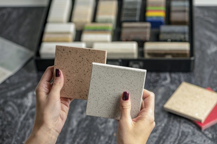
Learning how to choose grout colors for mosaic tiles also means checking what the tile manufacturer permits. A beautiful shade still needs a compatible grout formulation.
Glass Mosaics
Transparent or translucent glass can make surrounding installation materials more noticeable. Review the manufacturer’s recommendations for both mortar and grout, and test the complete assembly.
Do not assume every glass mosaic requires the same grout. Abrasive particles can scratch some finishes, so confirm compatibility before application.
Natural Stone Mosaics
Marble, limestone, and other porous stones may absorb pigment or develop unwanted edge effects. Ask whether the stone needs treatment before grouting and test any recommended sealer on spare pieces.
Choose grout approved for the particular stone. A neutral shade alone does not prevent staining or other compatibility problems.
Ceramic and Porcelain Mosaics
These materials offer many design possibilities, but textured or matte finishes may retain grout residue. Dark pigments can be especially difficult to clean from certain pale surfaces. Follow the tile supplier’s instructions and test cleanup beforehand.
Account for Joint Width and Room Lighting
Wider joints make grout more visually prominent. Narrow joints generally produce a subtler effect, although strong color contrast still draws attention.
Inspect spacing within each sheet and between neighboring sheets. Consistent joints help prevent a visible grid around the mesh-backed sections.
Grout color is only one part of creating a balanced tiled surface; the pattern and tile arrangement also influence how the finished floor looks. If you are choosing tiles for a narrow hallway, consider how the layout, grout contrast, and edge cuts will work together before installation. Explore these best tile patterns for narrow hallways for ideas on creating a more cohesive and visually balanced space.
Lighting matters, too. Compare samples under daylight and the fixtures you normally use. Warm under-cabinet lighting can change how a kitchen backsplash reads, while cooler bathroom lighting may emphasize different undertones.
Position wall samples vertically and floor samples horizontally. Viewing them in their intended orientation gives you a more useful comparison.
Build a Sample Board Before Committing

Choose two or three shades and install spare mosaic pieces on suitable sample boards using the planned materials and joint spacing.
Before testing grout shades, plan the tile arrangement carefully so the sample reflects the intended finished surface. Consider tile positioning, spacing, and edge cuts to see how the pattern will look once installed. These tips on how to plan a tile layout before installation can help you prepare a more accurate sample before making your final decision.
Apply each grout according to its instructions, including mixing, cleaning, and curing requirements. Assess the finished samples after the specified curing period rather than judging freshly applied grout.
Compare the boards close up and from the room’s normal viewing distance. Check whether the tile remains the focal point, whether sheet edges become obvious, and whether the grout coordinates with surrounding finishes.
Use physical samples for the final decision. Screens, printed charts, and digital mockups provide starting points, but they cannot reproduce every material and lighting condition.
Balance Appearance With Everyday Maintenance
Bright white joints may show kitchen grease or tracked-in dirt. Dark grout can make pale mineral deposits or soap residue noticeable. Midtone neutrals often provide a practical compromise, depending on the room.
Grout chemistry matters alongside color. Check suitability for shower floors, exterior exposure, or other demanding conditions. Swimming pools require products specifically approved for submerged applications.
Sealing requirements vary by product. Follow the manufacturer’s directions rather than assuming every grout needs sealing. Avoid adding household paint or unapproved colorants to alter a grout mixture.
When choosing grout for tile installations exposed to changing outdoor temperatures, consider the tile material and the conditions it will face. Talavera tiles used outdoors may need specific protection against freezing weather, so check the manufacturer’s care recommendations before installation. Learn more about how to protect Talavera tile from freezing weather when planning an outdoor tiled surface.
Frequently Asked Questions
1. What is the simplest approach to how to choose grout colors for mosaic tiles?
Decide between a blended or outlined finish, then test compatible shades beside the actual tile. Evaluate cured samples in the intended room before approving the final choice.
2. Should grout be lighter or darker than the tile?
Either can work. Similar shades create continuity, while a larger lightness difference emphasizes tile shapes. Choose according to the pattern and the amount of definition you want.
3. Is gray always the safest choice?
Gray is versatile, but its undertone may clash with warm stone or cream tile. Beige, taupe, or off-white may coordinate better with those materials.
Final Thoughts
I would rather compare a few finished samples than make this decision from a color chart alone. The most convincing choice supports the mosaic, suits the room, and meets the material requirements. Taking time before installation makes the finished result easier to enjoy.
For me, the best result balances appearance with practical care. Whether you prefer softly blended joints or clearly defined shapes, choose a compatible product and follow its installation instructions. A little preparation can help you achieve a finish you’ll feel comfortable living with for years.